ShopDreamUp AI ArtDreamUp

Deviation Actions


Suggested Deviants


Suggested Collections


You Might Like…


Featured in Groups


Description
>>>COMMISSIONS<<<


 EYES
EYES
TUTORIALS
PORTRAITS
TEXTURES
Image size
661x900px 575.29 KB
Make
NIKON CORPORATION
Model
NIKON D3200
Shutter Speed
1/125 second
Aperture
F/8.0
Focal Length
32 mm
ISO Speed
180
Date Taken
Aug 5, 2012, 3:15:28 PM
© 2012 - 2024 jane-beata
Comments49
Join the community to add your comment. Already a deviant? Log In
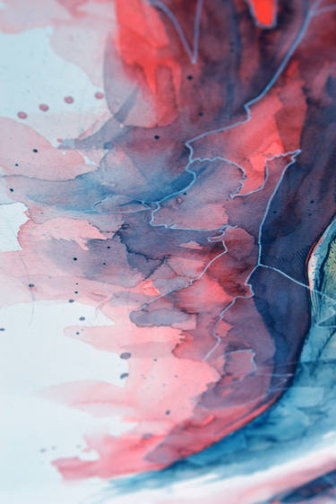
Overall, I think this is an exquisite piece. Beautifully done. It immediately captured my attention and compelled me to write some thoughts regarding it. Here are the elements that I observed:
+ First off, the technique is fantastic. The use of the flowing watercolor is beautiful. It gives the image a sense of movement and brings it alive.
+ Despite the flow for the watercolor, it does not look like the subject is drenched, which I think is really remarkable.
+ I think the choice to not blend things but to have discrete color boundaries was great. It adds to the striking quality of the picture that draws you to it.
+ Further the choice of ink lines was perfect. It takes a flowing image and adds some support and sharpness to it making it seem more tangible. Good contrast to the color flow.
- Still, I wonder if you were trying to have it be the image of a girl in water. However, when I first saw it it seemed very much to me a girl wearing a veil instead of it being water; actually it still looks like a veil to me. If the intent is veil then I do think the lines add tremendously to it. If the intent was water it takes away from its flow, so in that case perhaps not using the black lines would have been better.
+ There is a wetness to the image which I thought perhaps was an artistic element or an interpretation of emotion. Or perhaps an element of nature. But not water like in a swimming pool. The mystery adds to the appeal I think.
+ I do love the overall effect. In particular, I like that you didn't just stop at black lines but also have white lines demarcating other colors such as the shading around the eyes.
+ That brings me to the eyes. They have a very alive, wet look to them. The reflections and shadows intermingle beautifully and the flowing paint really adds to their realism. Of course their precise detail certainly provides the foundation for it all to come together.
+ The eyes, which look to me like female eyes, also have an intensity and intelligence about them which is nicely conveyed making is a compelling personality. So the simple picture speaks volumes about the person.
- I will mention though that the image scene is a fairly well-known layout. Focus on beautiful eyes hiding the rest of the face. Often used by photographers, film makers and artists. So if someone asked, "is the layout original?" I would say that it was not. However I would also add that it is stunning in its execution and that alone makes it quite unique.
+ This may seem like a trivial point to make but the choice of paper makes a difference and I think you chose very well. The texture definitely enhances the picture and gives it stability, like the lines do.
+ Overall I think your technique and creations are amazing and it is really a treat to see you create these beautiful works of art.