ShopDreamUp AI ArtDreamUp
Deviation Actions
Suggested Deviants
Suggested Collections
You Might Like…
Featured in Groups
Description
SPEED PAINTING VIDEO
(video can also be seen on Google+, if you are having troubles with YouTube: [link])
>>>COMMISSIONS<<<


 WATERCOLOR / MIXED MEDIA
 PORTRAITS
 TUTORIALS
 TEXTURES
Image size
658x900px 691.48 KB
Make
NIKON CORPORATION
Model
NIKON D3200
Shutter Speed
1/100 second
Aperture
F/8.0
Focal Length
24 mm
ISO Speed
400
Date Taken
Aug 6, 2012, 2:51:57 PM
© 2012 - 2024 jane-beata
Comments91
Join the community to add your comment. Already a deviant? Log In
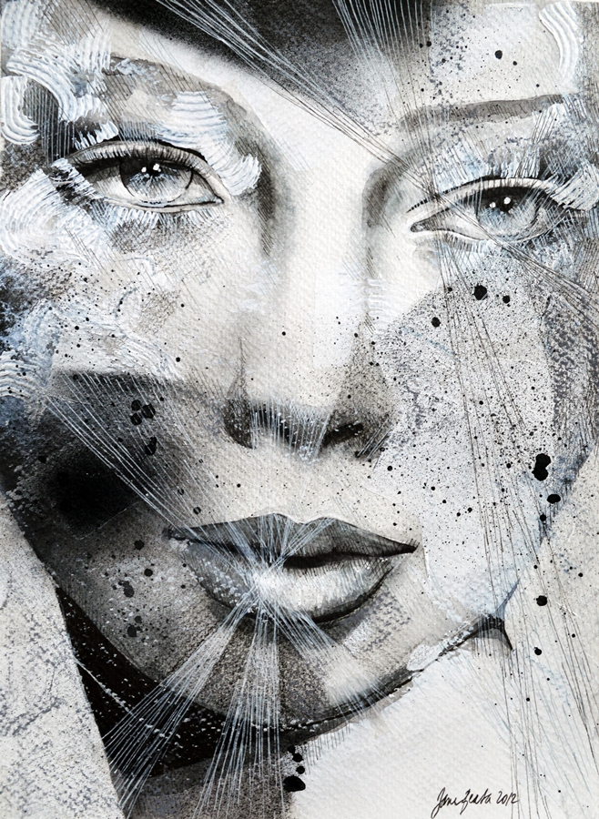
First I would like to say, to anyone who has not watched the video of this speed painting, it's amazing and very fun to watch! It starts out as a very realistic looking portrait, but about halfway through it really becomes completely different, with all the textures and a variety of media.
Thank you so much for making the video.
Three aspects of the painting that make it so beautiful:
1. The expression on her face; it is so calm and knowing. There is a lot of depth to the eyes that make it very emotional.
2. The different media and textures; this makes it interesting, I could not get tired of looking at all the different techniques that were used.
3. The choice of colors; black and white in this case is so powerful. Also some light blue - or is that my imagination?
And three things that I think could be better:
1. In the video, it started out with very dark shading in the crease of the eyelids and curving up to the eyebrows, but later white acrylic was added over that area. I think that may have taken away some the depth of the eyes. If it had stayed darker, the eyes would be more the focus.
2. There is acrylic spray on two areas: one of the cheeks, that looks very nice, and one on the forehead. I think the one on the forehead should not be such a straight line, because it adds too much harshness to the face. Because of this it is difficult to appreciate the nice curve of the woman's right eyebrow; it is drowned out by the spray. Or even if the spray were not so dark in that area, it would help.
3. This one is not so important, but still, the nose does not match the mouth. Both are well proportioned on their own, but the mouth looks like a front view while the nose is slightly angled view. But maybe the meaning of this was to add a small imperfection to the face, to make it more realistic.
I am always nervous when I critique art that is more advanced than mine, I hope this was helpful.
<img src="e.deviantart.net/emoticons/h/h…" width="15" height="13" alt="


![[ Crystal ]](https://images-wixmp-ed30a86b8c4ca887773594c2.wixmp.com/f/234a4235-2413-457d-aef7-df6eb9c29cb2/d58w532-8a882a4d-93a3-4676-b310-d0f9bc7bc1ac.jpg/v1/crop/w_184)


